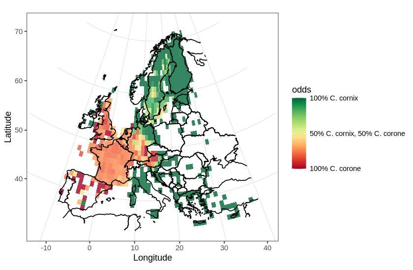
In this post, I will use a divergent color scale to plot two distributions on the same map. As an example, I chose to plot the European distribution of two species of corvids: the carrion crow (Corvus corone) and the hooded crow (Corvus cornix). There has been some adjustments to the taxonomical status of the hooded crow (see Parkin et al., 2003 for details), hoewever, currently, they are regarded as different species.
In this map, I will use a divergent color scale to show areas in Europe where each species is dominant, and also show areas where both species are present.
These are the libraries I will be using:
library(ggplot2)
library(maps)
library(readr)
library(dplyr)
library(RColorBrewer)
I will be plotting a map of Europe. After some trial and error, I settled for these coordinates for the map area:
LAT1 = 72 ; LAT2 = 34
LON1 = -12 ; LON2 = 40
I downloaded data from GBIF. I prefer to use the GBIF web interface to search occurrences for each (sub-) species of crow and then to download the data as two separate zip files. The data can then be loaded into a variable, and cleaned:
occ.cornix <- read_tsv(
  "./data/GBIF_Corvus_corone_cornix.zip")
occ.cornix <- occ.cornix[
  !is.na(occ.cornix$decimalLatitude) &
  !is.na(occ.cornix$decimalLongitude), ]

occ.corone <- read_tsv(
  "./data/GBIF_Corvus_corone_corone.zip")
occ.corone <- occ.corone[
  !is.na(occ.corone$decimalLatitude) &
  !is.na(occ.corone$decimalLongitude), ]
I then sub-sampled each data set to obtain an equal number of entries in each:
occ.cornix.sampled <-
  occ.cornix[sample(nrow(occ.cornix), 50000),]

occ.corone.sampled <-
  occ.corone[sample(nrow(occ.corone), 50000),]
I aggregated the raw occurrence data into tiles of one degree (for simplicity), and used the library dplyr to tally the number of occurrences in each bin. Then converted each result to a data frame:
occ.cornix.sampled$x <-
  round(occ.cornix.sampled$decimalLongitude)
occ.cornix.sampled$y <-
  round(occ.cornix.sampled$decimalLatitude)
tally.cornix <- occ.cornix.sampled %>%
  group_by(x,y) %>% tally()
tally.cornix <- data.frame(tally.cornix)

occ.corone.sampled$x <-
  round(occ.corone.sampled$decimalLongitude)
occ.corone.sampled$y <-
  round(occ.corone.sampled$decimalLatitude)
tally.corone <- occ.corone.sampled %>%
  group_by(x,y) %>% tally()
tally.corone <- data.frame(tally.corone)
I then applied the same procedure to both data sets combined, to obtain all tiles with crow occurrences:
occ.all.sampled <- rbind(
  occ.cornix.sampled, occ.corone.sampled)
occ.all.sampled$x = round(
  occ.all.sampled$decimalLongitude)
occ.all.sampled$y = round(
  occ.all.sampled$decimalLatitude)
tally.all <-
  occ.all.sampled %>% group_by(x,y) %>% tally()
tally.all <- data.frame(tally.all)
For each tile, I calculated the odds for both species. Odds are defined for each tile as:
- 1 means that only C. cornix occurs in this tile
- 0 means that both C. cornix and C. corone occur with equal probability in this tile
- -1 means that only C. corone occurs in this tile
tally.all$cornix.n <- rep(0, nrow(tally.all))
tally.all$corone.n <- rep(0, nrow(tally.all))

for (i in 1:nrow(tally.all)) {
  all.x = tally.all[i, "x"]
  all.y = tally.all[i, "y"]
  n1 <- filter(
    tally.cornix,
    tally.cornix$x == all.x &
    tally.cornix$y == all.y)$n
  if (length(n1)) {
    tally.all$cornix.n[i] <- n1
  }
  n2 <- filter(
    tally.corone ,
    tally.corone$x == all.x &
    tally.corone$y == all.y)$n
  if (length(n2)) {
    tally.all$corone.n[i] <- n2
  }
}

# calculate the odds
# 1 -> 100% cornix, -1 -> 100% corone, 0 -> 50% each
tally.all$odds <- (
  tally.all$cornix.n - tally.all$corone.n)/tally.all$n
The resulting first few rows of the data frame look something like this:
| x | y | n | cornix.n | corone.n | odds |
|---|---|---|---|---|---|
| -110 | 23 | 1 | 1 | 0 | 1.0000000 |
| -29 | 39 | 2 | 1 | 1 | 0.0000000 |
| -28 | 38 | 19 | 2 | 17 | -0.7894737 |
| -28 | 39 | 8 | 3 | 5 | -0.2500000 |
| -27 | 39 | 18 | 4 | 14 | -0.5555556 |
| -26 | 38 | 25 | 5 | 20 | -0.6000000 |
with:
- x: the longitude of the tile
- y: the latitude of the tile
- n: the total number of occurrences in the tile area
- cornix.n, corone.n: the occurrence count for each crow
- odds: a continuous value betwen -1 and 1, as explained above
Now, I use the maps library to load a line map of Europe. I applied the Albers equal area projection, as this is a distribution map.
world_df <- map_data("world")
proj <- coord_map(
  projection="albers",
  parameters=c(mean(LON2, LON1), mean(LAT1, LAT2)))
I defined a diverging scale using the brewer color palette RdYlGn (red to yellow to green) and defined and labeled 3 breaks into the color scale’s legend:
scale <- scale_fill_gradientn(
  colors = brewer.pal(10,"RdYlGn"),
  breaks=c(1, 0, -1),
  labels = c(
    "100% C. cornix",
    "50% C. cornix, 50% C. corone",
    "100% C. corone"))
Now plot the map and the data using the projection and the divergent color scale using ggplot:
ggplot(tally.all) +
  geom_tile(aes(x, y, fill=odds), alpha=0.8) +
  geom_path(
    aes(x = long, y = lat, group=group),
    data = world_df) +
  xlim(c(LON1, LON2)) + ylim(c(LAT2, LAT1)) +
  theme_bw() +
  labs(x="Longitude", y="Latitude") +
  scale +
  proj
References
GBIF.org (30 September 2020) GBIF Occurrence Download https://doi.org/10.15468/dl.gaah7n
GBIF.org (30 September 2020) GBIF Occurrence Download https://doi.org/10.15468/dl.d6zpbb
Parkin, D.T., Collinson, M., Helbig, A.J., Knox, A.G. and Sangster, G., 2003. The taxonomic status of Carrion and Hooded Crows. British Birds, 96(6), pp.274-290.