In a previous post, I dicussed how to get occurrence data from the Global Biodiversity Information Facility (GBIF). For my current project at the Natural History Museum in Berlin, I work on penguins. In this post, I will plot occurrences of penguin species on a map. Occurrence maps show the geographical position of occurrences.
Using OpenStreetMap
Many R mapping tutorials use Google Maps for their maps. Google started to require an API key in 2018. API keys are free, but Google requires your credit card data nonetheless. Using OpenStreetMap does not require registration, which is in my view a definitive advantage.
These are the libraries I will use for drawing the map using OpenStreetMap data:
library(OpenStreetMap)
library(ggplot2)
library(sp)
library (rgdal)
library(readr)
Defining the scope of the map
First things first define the coordinates of the area to draw. Penguins occur in the Southern Hemisphere only. Furthermore, many penguin species occur on Antarctica. Therefore, I want a map of the Southern Hemisphere, centered around the South Pole. The southern polar circle is at 66° south. However, penguins occur in the Southern Hemisphere up to the Equator. Drawing a map centered at the South Pole and comprising the area up the the Equator will result in considerable distortion. As a compromise, I will draw the area comprised between the Tropic of Capricorn, which is at approximately 23° south and the South Pole. Furthermore, OpenStreetMap as many other maps, natively uses the Latitude/Longitude format for storing data, and for practical reasons, the data is truncated at 85° north and south, so the poles themselves cannot be mapped.
The area of this map is therefore delimited by these coordinates:
# South of Tropic of Capricorn
LAT1 = -23 ; LAT2 = -85
LON1 = -180 ; LON2 = 180
Getting map data
OpenStreetMap provides several maps to choose from. I chose “esri-topo”, which is a topographic map in color; “stamen-terrain” or “stamen-toner” are good choices too.
The “zoom” parameter controls the level of detail. Zoom level 3 should be OK for a web presentation, you can set it higher if required, but downloading and processing time will increase accordingly.
map <- openmap(c(LAT2,LON1), c(LAT1,LON2),
   zoom = 3,
   type = "esri-topo",
   mergeTiles = TRUE)
print("done loading map")
Now that map data is stored in the variable “map”, you can plot it (ignore the x and y labels for now).
autoplot(map)
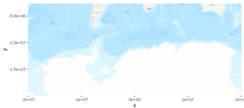
As data is natively stored in Latitude/Longitude format, plotting the map will be plotted using the Mercator projection by default. In this projection, Antarctica is stretched out to a band, and this is not the ideal projection for the purpose at hand. Later, I will re-project the map into a more suitable projection, but first, I will get the occurrence data from GBIF.
Getting data from GBIF
For this map, I downloaded data from the Global Biodiversity Information Facility (GBIF). As shown in a previous post, GBIF provides a library for downloading and handling GBIF data (rgbif). However, I chose not to use this library for downloading data, as the data I am interested in has more than 600.000 entries, and GBIF provides better ways of downloading large data sets.
Occurrence data can be searched on GBIF by opening the occurrences tab (above the search box). For this map, I selected Spheniscidae under “Scientific name”. After signing-in, I chose to download data in the “simple” format, which is a zipped text file containing data in tab-delimited format (one occurrence per row). You can leave the data zipped, as R can read compressed files without unpacking them first. I stored the data in data/GBIF_Spheniscidae.zip. Don’t forget to cite your data, a citation snippet will be generated for you.
The occurrence data can now be loaded into a variable. Note that it is not necessary to unzip the file before reading it, and that the data is in tab-separated format (TSV).
occurrences <- read_tsv("data//GBIF_Spheniscidae.zip")
print("done loading data")
Cleaning and sub-sampling the data
The map area covers the southern hemisphere from the Tropic of Capricorn southwards. Occurences north of the Tropic of Capricorn (23° south, stored previously in the variable LAT1) have to be filtered. Additionally, I want to display different species, so I filter out occurrences with no species name. Furthermore, 600.000 occurrences is a lot to plot. To speed things up, I will subsample the data and randomly select 10.000 occurrences.
# filter out occurrences above LAT1
occurrences.sampled <-
   occurrences[occurrences$decimalLatitude < LAT1, ]
# filter out occurrences without species name
occurrences.sampled <-
   occurrences.sampled[!is.na(occurrences.sampled$species) &
   occurrences.sampled$taxonRank == 'SPECIES',]
# randomly sample 10.000 occurrences
occurrences.sampled <-
   occurrences.sampled[sample(nrow(occurrences.sampled), 10000),]
print("done sampling data")
Pojecting the map and the data
There are many possible map projections. Projection definitions are searchable on the EPSG website. The projection I want is called Antarctic Polar Stereographic projection, and can be found at https://epsg.io/3031. R reads map projections in PROJ.4 format. The projection definition string provided by EPSG in PROJ.4 format is stored in an R variable:
proj <- "+proj=stere +lat_0=-90 +lat_ts=-71 +lon_0=0 +k=1 +x_0=0 +y_0=0 +datum=WGS84 +units=m +no_defs"
The map can now be re-projected and re-drawn:
map.proj <- openproj(map, projection = proj)
autoplot(map.proj)
Now I have to project the data. As the original data is in Longitute/Latitude format, first, the original projection has to be added to the data, and then the data is re-projected using the same projection as the map (previously stored in the variable “proj”):
# add longitude/latitude projection to the data
coordinates(occurrences.sampled) <- c("decimalLongitude", "decimalLatitude")
proj4string(occurrences.sampled) <- CRS("+proj=longlat +ellps=clrk66")
# re-project the data
occurrences.proj <- spTransform(occurrences.sampled, CRS=CRS(proj))
Now the data and the map can be drawn. I also removed non-data clutter.
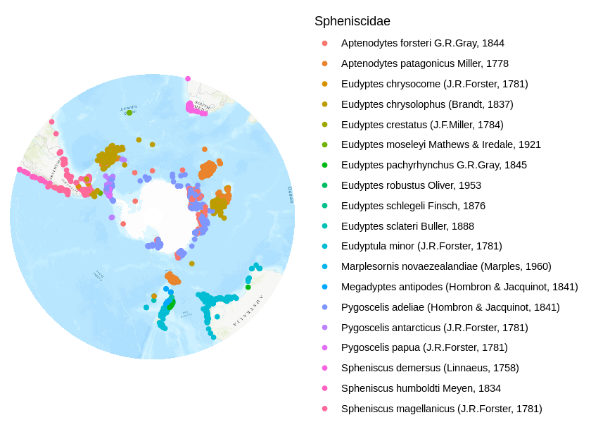
autoplot(map.proj) +
geom_point(
   data = data.frame(occurrences.proj),
   aes(x = decimalLongitude, y = decimalLatitude,
   color=scientificName),
   alpha=1
) +
theme_classic() +
theme(
   axis.title=element_blank(),
   axis.text=element_blank(),
   axis.ticks=element_blank(),
   axis.line = element_blank()
) +
scale_color_discrete(name = "Spheniscidae")
References
Roger S. Bivand, Edzer Pebesma, Virgilio Gomez-Rubio, 2013. Applied
spatial data analysis with R, Second edition. Springer, NY.
https://asdar-book.org/
Roger Bivand, Tim Keitt and Barry Rowlingson (2020). rgdal: Bindings
for the ‘Geospatial’ Data Abstraction Library. R package version
1.5-12. https://CRAN.R-project.org/package=rgdal
GBIF.org (27 August 2020) GBIF Occurrence Download https://doi.org/10.15468/dl.jgpg3b
Ian Fellows and using the JMapViewer library by Jan Peter Stotz
(2019). OpenStreetMap: Access to Open Street Map Raster Images. R
package version 0.3.4.
https://CRAN.R-project.org/package=OpenStreetMap
Pebesma, E.J., R.S. Bivand, 2005. Classes and methods for spatial
data in R. R News 5 (2), https://cran.r-project.org/doc/Rnews/.
Scientific Committee for Antarctic Reasearch (SCAR) Antarctic Digital Database (ADD) manual (2005). EPSG:3031 WGS 84 / Antarctic Polar Stereographic. https://epsg.io/3031
H. Wickham. ggplot2: Elegant Graphics for Data Analysis.
Springer-Verlag New York, 2016.
Hadley Wickham, Jim Hester and Romain Francois (2018). readr: Read
Rectangular Text Data. R package version 1.3.1.
https://CRAN.R-project.org/package=readr